Fashion house - 3/8/22
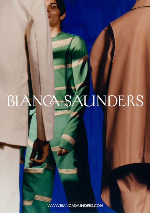
A modernisation and re contextualisation of typography typically seen in historic works across British history is one line which identifies the over-arching design inspiration for the new Bianca Saunders logo - paired with the stylistic approaches typically associated with the menswear designer and a need for a luxurious premium finish to match the brand's elevation. The biggest driving force was ensuring the logo provided personality and allows the brand to be well defined within the fashion space, and not simply being synonymous with another, easily identifiable as Bianca Saunders own.
Creative Direction - Bianca Saunders
Graphic Designer - Jonathan Isaacson
Typography - Kia Tasbihgou
Designer:
Bianca Saunders
SHARE